
Among all digital marketing assets, landing pages seem to get the least attention despite being the final destination for your target audience before they are formally converted into leads.
A landing page should be designed to meet the expectations of the traffic, and it should also consider their journey in terms of the marketing material they consumed prior to the click-through. Every landing page serves a purpose, and a single campaign could be using its multiple versions to accommodate visitors from different sources.
Landing pages are designed to spark visitors’ interest, engage them, encourage them to take action, and, of course, reinforce their decision. Any conversion-focused marketing effort relies on them to commence lead warming efforts.
In this post, we’ve listed 11 deadly landing page mistakes that far too many marketers commit. These are based on inputs from reputable UI UX development services providers since they come across such issues frequently during initial consultations. You may save hundreds of dollars in lost revenue if you avoid these blunders.
11 Deadly Landing Page Blunders
What could be more disheartening than investing in a sophisticated lead generation program that spans over paid and organic marketing over different platforms only to lose paying clients because of faulty landing pages? This is more common than it appears since most marketers don’t view them as strategically important digital assets.
With caution, read the following 11 massive landing page blunders to avoid:
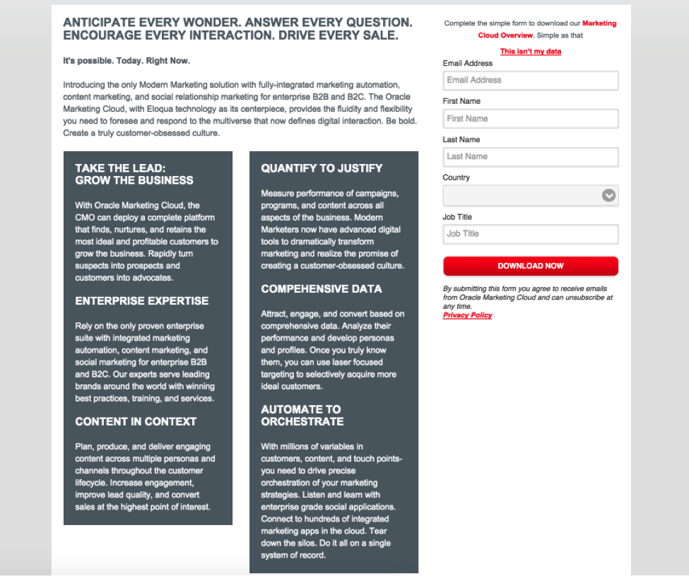
- Using Homepage As The Landing Page
Instead of a specific landing page, 44% of B2B clicks are routed to a home page. So, where do your visitors go when they come to your website? Sending ad traffic to a specific landing page improves page relevancy, but sending visitors to a page that has no relation to the ad itself causes bewilderment, loss of trust, and abandonment.
While we aren’t opposed to referring users to a homepage or services page, the pages should maintain some consistency between the ad and the page. When you’re running numerous ads that all link to the same page, this gets more challenging.
Home pages, for example, are frequently generic. This implies that whatever message drew readers to the page is unlikely to be repeated on the homepage (or will be lost amongst a lot of other content).
- Having Too Many Form Fields
Obtaining invasive information (such as contact information) from your audience too quickly can create a scary experience for them, and they will flee.
By shifting these demands to the last steps and on a multi-page form, you have a higher chance of getting your audience to fill out the personal contact information fields (which are the most crucial fields). First, warm up your audience.
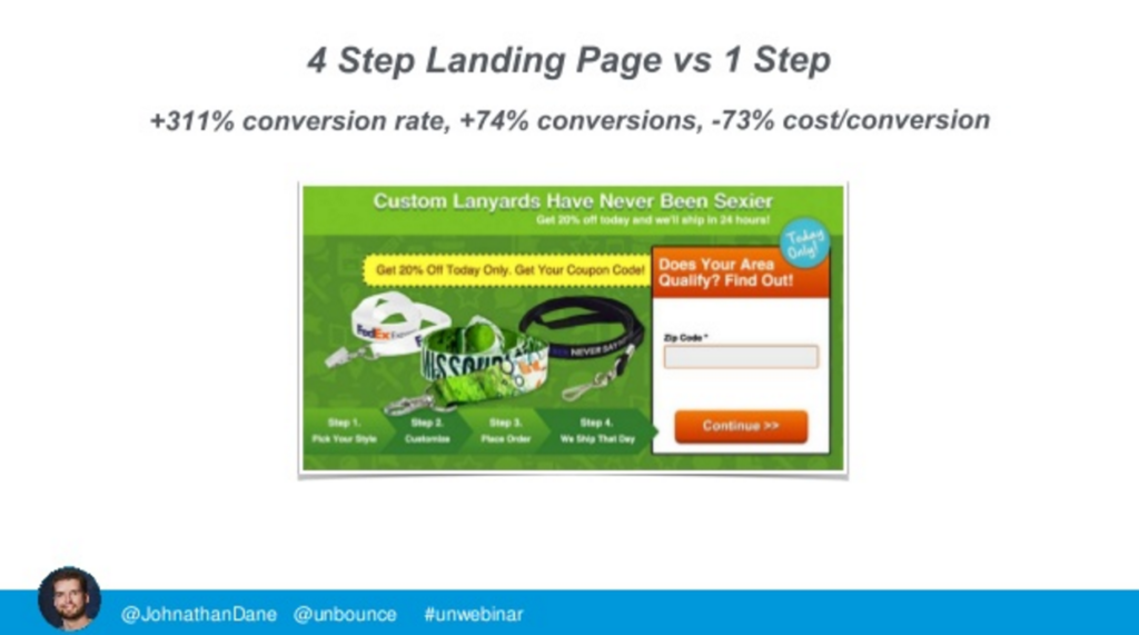
It’s a big error if you don’t obtain the goldilocks-just-right form length. A 214% conversion rate boost was achieved by switching from a one-step landing page with three fields (name, email, and phone) to a two-step landing page with seven fields.
- Branding That Isn’t Consistent
A landing page can be spectacular in terms of click-throughs, engagement, and even conversions to the next step, but as visitors go past the landing page and into “the next step,” conversions begin to decline.
The lack of consistency between the landing page and the rest of the site might be the cause of this. A landing page that deviates from a website’s standard branding, color scheme, and messaging may provide early results, but it will almost always result in a bad user experience beyond the initial interaction.
- Keyword Specificity Is Lacking
Another approach to quickly make your landing page more relevant is to exhibit consistency with the keywords that a visitor used to discover it. To your visitors, you have the opportunity to appear local, relevant, and genuine. Customize your message even further by including dynamic text in your ad copy, button copy, and landing page title, keywords, and description.
Dynamic text replacement (DTR) allows you to simplify your landing page testing while avoiding overspreading visitor data points. This allows you to have a single page dedicated to different keywords, allowing you to attain statistical significance faster in your testing. Not to add, when utilized appropriately, DTR may help you enhance your AdWords quality scores.
We would also like to add that don’t use too much technical terminology since the decision-maker isn’t always the person using your products/solutions. Use a fine mix of relevant wording and laymen terms to create attractive landing page content. Keywords are indeed important, but you should understand that landing pages don’t need to pass all the scrutiny of SEO.
- Proper Call To Action Button Strategy
Your call to action (CTA) is the beating heart of your landing page. It’s critical to aim towards micro-conversion.
We notice a lot of typical blunders when it comes to calls to action. To begin with, you may have an excessive number of them. Alternatively, you might have positioned the CTA at the bottom of the page or even made the CTA the same color as the website backdrop. Visitors should not have to waste time hunting for your call to action.
So, how can you ensure that your CTA is visible and clickable? Here are some tips:
–Less is more in this case. One CTA per landing page is a good idea.
–Keep it out in the open. Place the CTA at a place where the visitor may see it.
–Make it stand out. Use a hue that contrasts with the rest of your page’s design.
On top of that, make sure it is in line with the visual hierarchy principles because this way, you can get a far better conversion rate than investing heavily in the design and copy.
CTA Button copy and alignment play a huge role in determining your conversion rate, so it would be wise of you to position them in the high visibility areas. Ideally, they should be placed in the upper fold of your landing page with proper isolation from any surrounding elements.
Also, there should be as a minimum number of outbound links as possible on your entire destination page since that would be a direct leak in your sales funnel. These are also the most important aspects as mentioned by digital marketing services providers.
- Deceptive Headlines
You want to know exactly what a web page is about as soon as you get on it. As a result, your eyes begin to scan the headlines for clues as to what you’re going to buy.
If the title of your landing page is unrelated to the ad that visitors clicked on, they are likely to exit the website right away. It’s time to update your title if it’s not enticing your visitors to learn more about your goods. Make sure your title sticks out in terms of color and size.
It is no secret that headlines grab the most eyeballs, but this also translates to the fact that if they appear to claim things too good to be true, your landing page will be discarded as spammy.
Avoid sounding like a dubious business involved in a Ponzi scheme. Staying realistic will actually help you gain trust while you can definitely provide your readers with concrete data to make your point.
- Not Standing Out From The Crowd
A landing page is your greatest chance to establish what sets your service or product apart from the competition. Identifying what makes your firm distinctive, on the other hand, is a big task. How can you stand out in a sea of competitors? The truth is that items and even services have gotten so commoditized that customers have difficulty distinguishing between them.
Determine the major points of distinction between you and your rivals. Give them a reason to choose you, but don’t go overboard. You have already convinced them. Trying to win their trust, once again, is surely going to make you look like an idiot.
Instead, you can go for a few aspects that give your viewers a strong reason to click through. This includes success stories, social proof, testimonials from renowned personalities/brands, and a clear overview of the pricing strategy. This will help you throttle your conversion rates unless you make any too obvious to be ignored type of mistakes.
- A Lot of Junk Copy
Don’t squander your valuable landing page after all of your hard work in attracting visitors. They will flee if there are too many words on the page.
Too much material on your landing page comes off as unpleasant clutter that visitors don’t want to commit to reading, according to those who claim we’re all too busy to read and have a decreasing attention span. And as we discussed, it’s unnecessary to persuade someone who’s already agreed to what you said in your marketing material.
Some tips to make your landing page copy more appealing:
-Write something that others will want to read.
-Do not attempt to be cute.
-Clarity is superior to all other qualities.
-If you can express yourself in fewer words, do so.
Would you read all this?
This is the reason why your landing page copy should be crisp, and it should use plenty of power words. It should also contain illustrations and other rich multimedia that is in line with the source destination of your traffic. Less is certainly more when it comes to landing page copies, and relevance is the key to acing at it.
- Copy That’s Not Relevant
Stop, remove, and make your text relevant even if you have a little piece of material on your page that has nothing to do with your offer.
Focus on the website’s purpose, and be explicit and unambiguous about your offer, as with everything else on the page. You must decide what your unique selling proposition (USP) and value proposition are, as well as how they will provide real-world value to your prospects. The easiest method to avoid cluttering your website is to keep it brief while still including essential, crystal clear information. Use graphics and icons to convey your message to your audience.
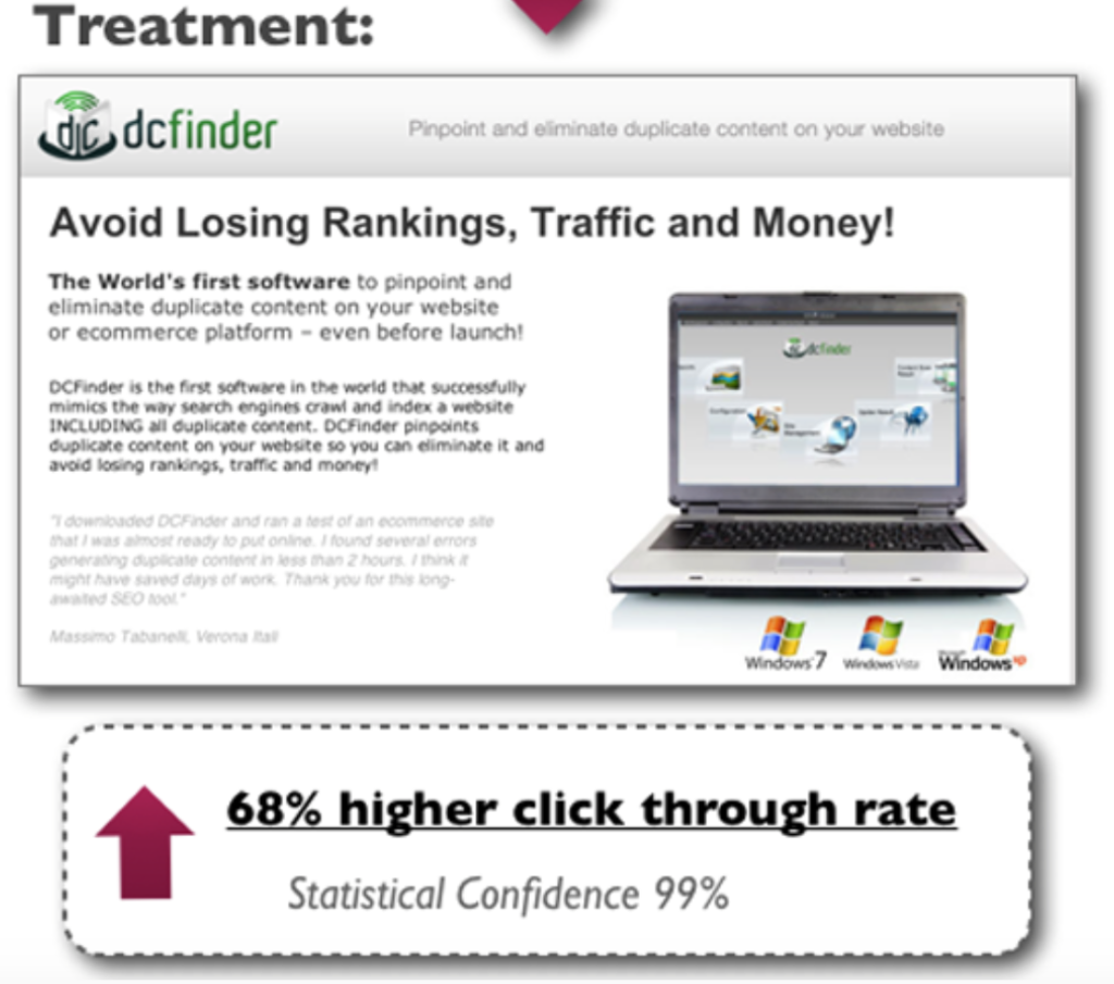
Below is an excellent example of unnecessary copy (on the left) being transformed into helpful words (on the right):
- No Clear Aim For The Page
Bad landing pages frequently try to accomplish too much at once. This just adds to the visitor’s confusion about how to continue. Depending on the campaign you’re running and the source of the visitor, you’ll need to figure out exactly what you want them to do and make it crystal obvious on the page.
This isn’t to say that secondary aims aren’t important. They should never share the importance of a major aim, though. Anyone should be able to tell what to do next just by looking at the website.
- You Didn’t Follow Through On Your Promise
The fastest way to disappoint your audiences is to not match the content, headline, text, personality, look, and feel of your ad to the landing page.
Make sure your landing page accomplishes exactly what you say it would. The following step on your Thank You page should be the same.
Set the right expectations for your visitors and keep your promises. If you claim you’ll give away an ebook, be specific about how and when the visitor will receive it.
Making promises, you can’t keep a certain way to get a visitor to leave. A landing page that commits this mistake even unintentionally will do a lot more damage than the benefit it would extend. This is due to the fact that it creates a negative impression of your brand, which can be far more damaging due to the trust deficit that’s created. Undoing such an ill reputation can be a costly affair, so it’s best to keep a close check on your landing pages for such errors.
Summing Up
You can’t just slap some text and images together and call it a landing page. Instead, invest some time and money in page design, copywriting, and testing your options. There are many more tips and techniques to creating the ideal landing page, but if you avoid these 11 blunders, you’ll be well on your way to higher conversion rates and visitor happiness.
Author Bio:
I’m Matt Robson, Digital Marketing manager and enthusiastic Business Development professional working with Techcronus and assisting our clients. I frequently share content about exploring and writing about enterprise software solutions, Microsoft dynamic, business intelligence, custom software development and web & mobile app development.