

When running a business, whether it is online or offline, it thrives through conversion. These are people who check out your business and eventually become paying customers.
If your company has an online presence, this means ensuring that your website has user experience (UX) elements. These are design elements and website features that can help increase your website’s conversion rate.
What’s a UX Design and How Does it Impact Conversion?
Do you know that 88% of online shoppers would not want to return to a site after a bad experience? This also explains why 7 out of 10 website businesses fail due to a lack of UX design.
The thing is, user experience should start the moment visitors land on your site. What happens during this process is essential since it affects whether or not users are satisfied with your site. Their experience is affected by its visual appearance, content quality, site navigation, call to action, and more.
If you can provide excellent UX to your website visitors, it can help boost your conversion rate.
UX Design Hacks to Increase Web Conversion Rate
Now that we have identified how UX design can impact your conversion, here are 16 pretty handy tips on how you can improve your site’s web conversion rate:
Popping CTA Buttons
When making call-to-action buttons for your site, it is essential to emphasize the action that you want your visitors to take. After all, CTAs are integral in boosting your conversion rate. This is also applicable if you have a yes-no option.
Rather than creating an imbalance by making a button look a lot larger than the other, you can be more subtle. For example, you can use contrasting colors.
When you get rid of the color from the “negative” CTA button, you shift the person’s attention to your desired action.
You’ll often come across this on cookie bars, requesting users to accept site cookies. Usually, the “Accept All” or “Okay” buttons are the ones that are more visually prevalent. Meanwhile, the negative buttons look more washed out.
This is a way to increase the likelihood of visitors accepting the cookie terms.
CTA Colors and Designs
How colors can affect your site visitor’s purchasing behavior is a popular topic. You’d often hear how green CTA buttons are a lot more effective than red ones. That’s because greens mean to go, and red means stop.
Sure, your brand’s color can affect how people perceive it.
But when we’re talking about conversions, the colors don’t seem to matter so much. Instead, what matters is the contrast and visibility.
Usually, a more significant, higher contrast CTA will make your next logical click evident, making it easy to make a conversion. You can also work with reputable web designers like Michelle Dipp, specializing in brand identity, visual communication, and UX/UI design.
Efficient Use of White Spaces
Are white spaces a crucial element to a great design? Yes, it is! While it is one of the essential facets of web design, the power of white spaces can sometimes be underrated.
Here’s what a white space will do:
- White spaces around titles and texts will prompt user attention.
- Create a better user experience
- Make it easy for your content to navigate.
- Let visitors stay longer on the web page.
- Enhances readability and drives a site visitor’s attention to the correct elements.
- It helps visitors navigate one object on the page to another.
- However, make sure that you still need to create a sense of balance between the white space and essential site information.
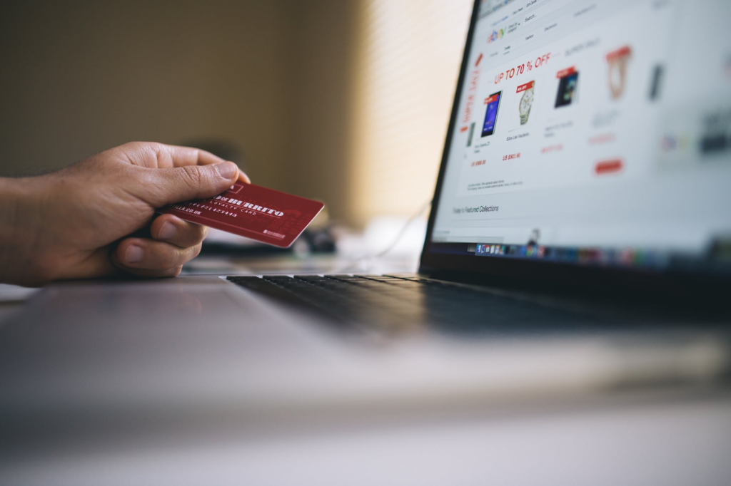
Reinforced Security for Sensitive Fields
If your site is handling sensitive data, then you’d be needing a security program and even a security badge to be shown on the checkout page. That’s because adding these, according to a study by the Institute, can make payment fields look more secure.
Users will also feel more confident about your website if you display your web security badges. Although security programs protect the whole page, adding these visual reinforcements will give users a better “gut feel” about your site. More so if they are placed near a field that asks for sensitive data like your shipping address.
Since security issues are one of the reasons visitors leave a website, it’s vital to reinforce these security badges.
Robust Contact Form
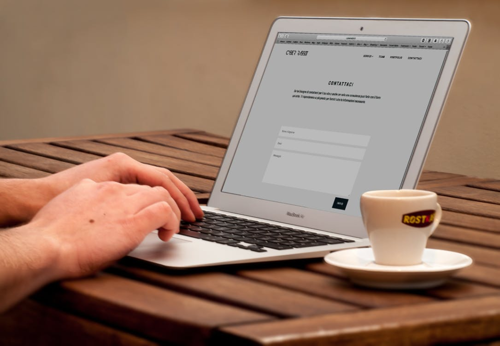
When users visit your site, most of them will look at the “Contact Us” option. Adding a prominent link on your content form will show that you’re open for your customers to get in touch.
It also shows that your site is trustworthy and reliable. This is true, especially if a customer doesn’t know you and has no idea whether or not you’re a great company and have dependable services. By knowing that they can quickly get in touch, you can alleviate those hesitations from them.
Better and Simpler Web Forms
Did you ever want to purchase an item online, only to be given a form that takes forever to fill out?
According to a study by Google, looking for the structure and format of web forms can significantly affect how a user can finish and submit a form.
To do this, you need to clarify which particular fields are mandatory and which ones are optional. You should also indicate any specific instructions, like whether the password field is case-sensitive. An error message should also show on the erroneous fields instead of at the bottom of the form.
Multimedia Content
49% of marketers utilize visual content on their websites and social media channels more than written text.
To create a positive impression on your audience, be more memorable, and gain more conversions, every design step should be unique. It should contain appealing images, icons, diagrams, charts, drawings, infographics, and the like.
Try to stay away from using overused stock photos as well. Chances are, this cheapens your brand, and your site wouldn’t be as appealing.
Straightforward On-site Search
You need to help your customers to find what they’re searching for. A user-friendly search bar will help drive in more conversions, sales and boost your engagement.
A great example is Amazon that has a tremendous on-site search performance of 97.9. It features an easy-to-use search box along with a simple drop-down menu that helps specify the product you’re looking for.
Here are on-site search best practices:
- Allow autocorrect, autocomplete filters
- Auto-suggest and recommendation
- Extensive facets and filters
- Typo-tolerant search box
- Compatibility on mobile search
Responsive UX
An integral part of user experience is responsive UX. This lets websites automatically change layouts depending on screen size. This ensures that your visitor will have a consistent experience whether they are on desktop or smartphone.
Having a responsive design makes sure that your site works well from all devices.
These days, people are browsing sites while they’re at work, on the logo, or in the comfort of their own homes. Even if they have a computer nearby, they’ll still use phones or tablets to browse through sites.
If your site doesn’t work well on mobile or tablet, people won’t bother to look your site up from their computer. Eventually, this might cause you to lose prospective customers because your site isn’t responsive.
That’s why you need to have a responsive site so that more people can access and buy from your site no matter what device they use.
Drop-down Menus
Drop-down menus serve as a compass to users who want to navigate your site until they look up the products they’re searching for.
That’s why you must test your drop-down menus so that you can ensure the usability of your site and maximize the conversion rate.
Apart from the category drop-down, the ‘my account’ drop-down is also a great way to improve UX.
Consistent Color Palettes
If you’re designing a landing page, you need to restrict your color palette depending on your brand. Too many colors can create a distraction. Thus, users won’t know where they need to focus and put their attention.
If you limit your color choice to one or two but still use their shades and hues, then you can come up with a more balanced design. Colors are like emotions. If you use too much of it, it can overwhelm anyone who will visit your site.
That’s why it’s always best to pick a UI color that matches your brand identity. This is a great way to promote consistency in your overall UX design and enhance overall recognizability.
Better Readability
Readability affects your site’s user experience. The composition of your content can affect how your audience will consume and respond to your message.
To boost your site’s readability, here are a couple of things to keep in mind:
- Make use of concise sentences to make texts a lot easier to read and comprehend.
- Make texts big enough for people to read comfortably.
- Utilize bulleted lists.
- Divide long paragraphs into smaller portions.
- Don’t underline words that aren’t liked.
- There shouldn’t be any more than two lines in a paragraph.
- Use text that contrasts color to the background.
- Make sure that the text on your site is also readable. Also, watch out for grammar mistakes and clarify your content.
Unnecessary Design Elements
Another way to improve web UX is to remove any distracting elements.
Make sure that you only pick essential elements for your site. This means eliminating redundant features and design modules that distract your site visitors from completing their tasks. This explains why an effective landing page does not have a navigation menu.
Here are a couple of items that should be removed from your site:
- Unnecessary ads
- Irrelevant images
- Blinking banners
- Un-maintained accounts on social media
- Irrelevant testimonials and reviews
Unnecessary design elements can lead to a negative user experience. This decreases your chance of attracting and attracting your site visitor’s attention. This also shrinks your chance of converting them into loyal, paying customers.
Easy Checkout
There’s a lot of debate whether or not single or multi-page checkouts can convert better. However, there’s not an absolute answer to the questions.
There are some cases where a single page checkout works well. In other situations, a multi-page checkout can do a lot better.
For e-commerce, you should significantly decrease the checkout process. Unfortunately, most retailers stick with a multi-page checkout process.
If you want to boost your online store’s conversion rate, consider experimenting with a single-page alternative.
Guest Login
A lot of customers today are wary of sharing their private information on the site.
Sure, people would want to buy your products. But it might not be enough reason for them to create an account on your online store.
Not allowing guest login can hurt your conversion rates in the long run. That’s because customers would rather skip purchasing altogether than be bombarded with promotional offers. This includes upsells, newsletters, and the like.
That said, let your site visitors do their tasks without the need to sign up and create an account. Instead, let them create an account by linking it with their social media channels. Doing so eliminates the need to fill out a sign-up form, reducing the friction preventing them from converting.
Multivariate Test
Here’s the thing: You cannot fix what you cannot measure. Luckily, you can conduct a test to see which web design elements hinder you from driving conversions.
By doing so, there’s no place for any discrepancies and errors that will hurt your conversion rate.
What are the testing types for e-commerce sites?
- A/B test
- Database test
- Functionality test
- Usability test
- Security Test
- Performance Test
- Mobile app/responsiveness Test
Final Thoughts
Your site’s UX is crucial. So, if you want to boost your site’s conversion rates, look at whether your design elements are making it easy to do so.
You can start by testing your one element, like your CTA button, and see whether it nudges people to take action. And then, you can come up with an informed decision on how you can boost your website’s conversion rate.
Because if you boost your conversion rate, it can be tantamount to an increase in sales.
Author Bio:
Andi Croft is a freelance writer interested in topics related to business, technology, and travel. She has a passion for meeting people from all walks of life and bringing along the latest tech to enhance her adventures.